Brand Guidelines
This guide defines the visual language, design style, and principles of Coastal Luxury Homes.
Our approach is grounded in simplicity and sophistication. We’re not reinventing, we’re elevating — enhancing the familiar with clarity, intention, and steady confidence. Every element, from typography to imagery, is designed to feel natural to our team and collaborators, while expressing a heightened sense of balance and sophistication.
Contents
01 Brand Strategy
Coastal Luxury Homes creates design-led homes and communities, masterfully built to embrace daily living through architecture, craftsmanship, and enduring quality.
We build across Fairfield County’s most sought-after communities, partnering with clients, architects, and craftsmen who share a commitment to thoughtful design and precise execution.
Our work is defined by vision in design, rigor in construction, and a measured, highly personal client experience. Every project is an opportunity to create something lasting —timeless in design, built to endure.
02 Voice
At its core, Coastal Luxury Homes embodies a shared understanding of how people want to live. It values process as much as outcome, approaching each project with clarity, and a deep respect for both client and context.
The brand is confident yet restrained, elevated without excess, and modern without chasing trends. It speaks with calm authority and a clear point of view, guided by longevity over novelty.
Tone & Voice
Clear and Composed
Language is simple, structured, and easy to understand —never too complicated or abstract.
Elevated, Not Ornate
Sophisticated without being decorative. Avoid buzzwords, filler, or overly expressive language.
Warm but Disciplined
Approachable and human, while maintaining a strong sense of control and refinement.
Future-Focused
Speaks to longevity, evolution, and the future of design-led living.
Voice Principles
Lead with Purpose
Start with a clear idea. Avoid long introductions or unnecessary framing.
Avoid Superlatives
No “best,” “world-class,” or “luxury at its finest.” Let the work and clarity speak for themselves.
Be Specific, Not Generic
Use language grounded in design, architecture, and experience — never vague or corporate.
Speak as a Point of View
Not passive or neutral. The brand has a perspective and communicates it with confidence.
Purpose & Mission
WHY
Elevate daily living.
Mission
To design and build homes of lasting quality — grounded in context, shaped through collaboration, and defined by craft.
Descriptors
Custom home builder. Luxury Home builder.
Design-led, architecture forward.
Application
COMMUNITIES
Residential communities, reimagined with signature homes that embrace timeless design and quality.
rentals
A limited collection of design-driven residences in the most walkable towns of Connecticut’s Coastline.
CUSTOM HOMES
Bespoke homes designed and built in close collaboration with clients, to elevate daily living.
Lorem ipsum dolor sit amet
Crafted for elevated living.
GEneral About
Design-led homes and communities, masterfully built to embrace daily living through architecture, craftsmanship, and enduring quality.
03 Logo
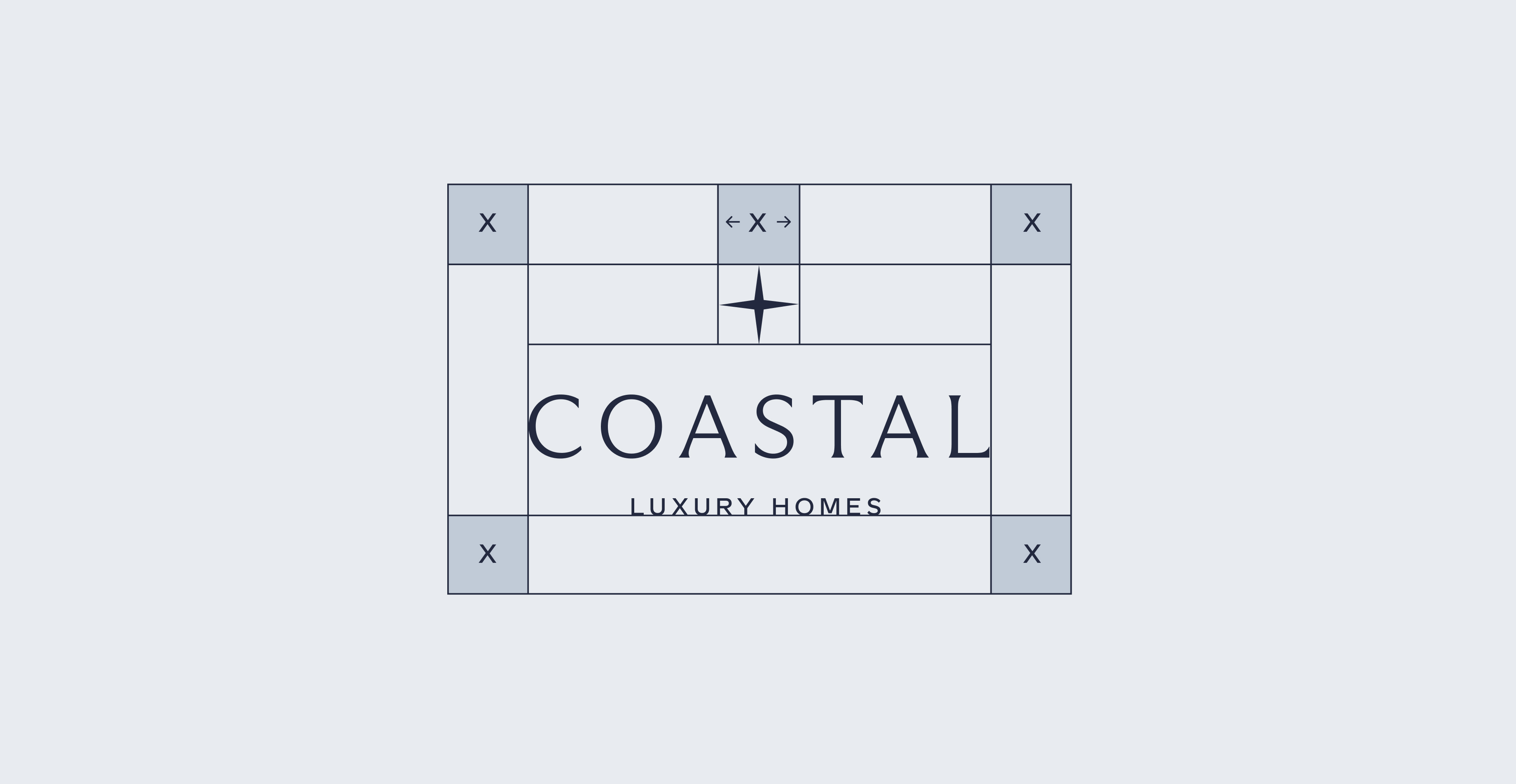
Our logo reflects the brand’s core philosophy: refined, purposeful, and enduring. Its minimalist wordmark is paired with a distinctive star-compass symbol — an emblem symbolic of guidance, direction, and place four millennia. Together, they express Coastal’s commitment to creating homes and communities that are built with intention.
To support this identity, Arizona Flare was selected as the primary logotype typeface. Defined by its high-contrast strokes, sharp details, and balance of classical elegance with modern restraint, the typeface brings a sense of sophistication and timelessness.
Primary Lockup


Clearspace
Secondary Lockups


Incorrect Usage
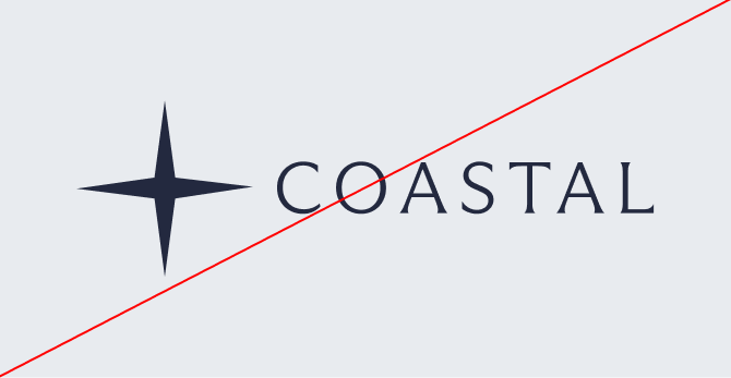

Do not resize the mark
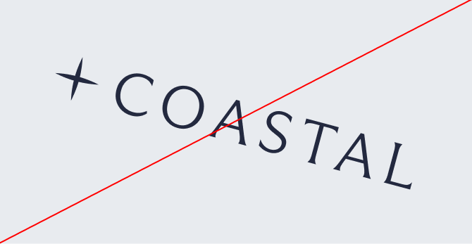
Do not rotate the logo
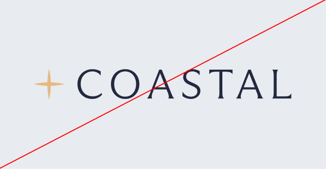
Do not change the color
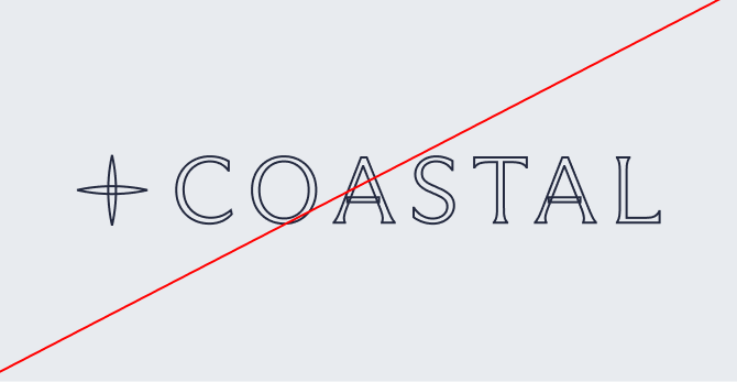
Do not outline the logo
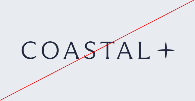
Do not reverse the Mark
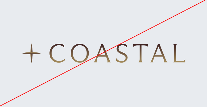
Do not add gradients
04 Color
A foundation of imperial blue and crisp white defines the palette — clean, composed, and timeless.
Layered softer blues provide depth and softness, bringing a subtle coastal sensibility that remains refined and restrained.
Primary Palette
crisp white
Hex: #ffffff
RGB: 255, 255, 255
CMYK: ???
PANTONE: #000000
imperial blue
Hex: #FA9819
RGB: 35, 41, 63
CMYK: ???
PANTONE: ???
Secondary Palette
Shadow
Hex: #4F576B
RGB: 79, 87, 107
CMYK: ???
PANTONE: ???
serene blue
Hex: #8398B3
RGB: 131, 152, 179
CMYK: ???
PANTONE: ???
Color in context
COASTAL


Design-led homes and communities, masterfully built to embrace daily living through architecture, craftsmanship, and enduring quality.
coastal-lux.com
LUXURY HOMES
Main communication
Main color: crisp white
secondary color: imperial blue
COMMUNITIES
Reimagining residential communities with signature homes that embrace every aspect of daily living.
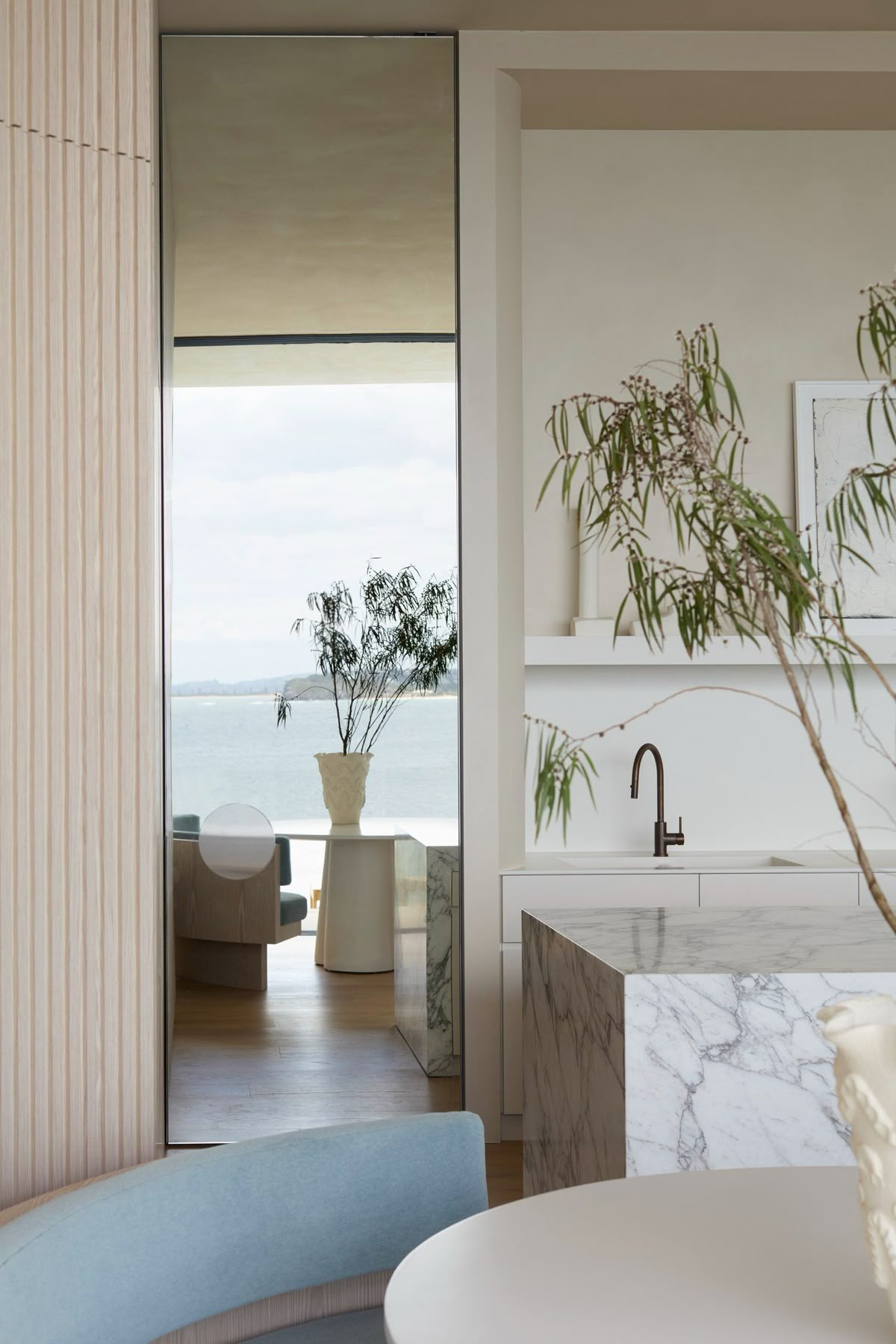
communities
Main color: shadow
secondary color: crisp white
Custom homes
Bespoke homes designed and built in close collaboration with clients, to elevate everyday living.
Custom homes
Main color: imperial blue
secondary color: crisp white
rentals
A limited collection of design-driven residences for lease in the most walkable towns of Connecticut’s Coastline.
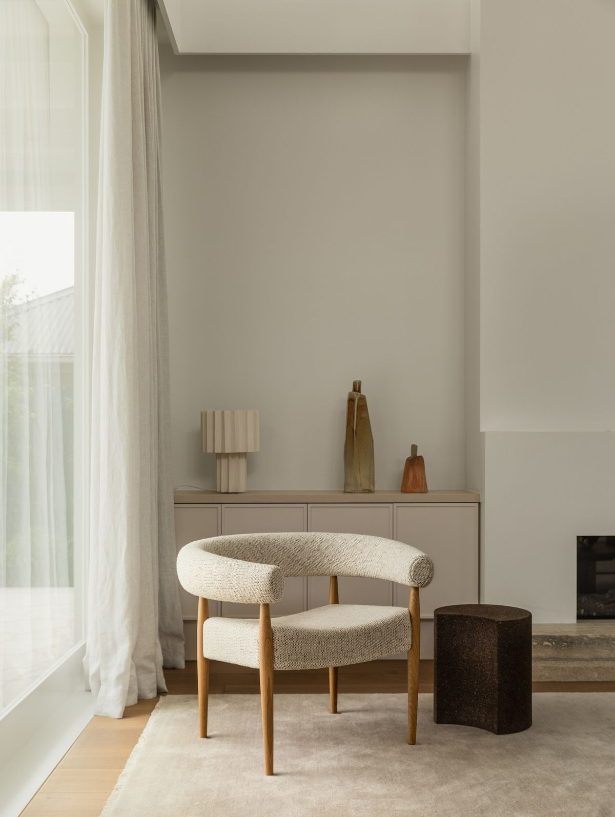
rentals
Main color: serene blue
secondary color: crisp white
05 Typography
Arizona Flare is Coastal’s primary typeface, selected for its refined character and timeless elegance.
Inspired by classical proportions yet interpreted through a modern lens, Arizona Flare reflects Coastal’s commitment to thoughtful design, architectural clarity, and enduring quality.
It is used to give the brand presence, personality, and a strong visual point of view.
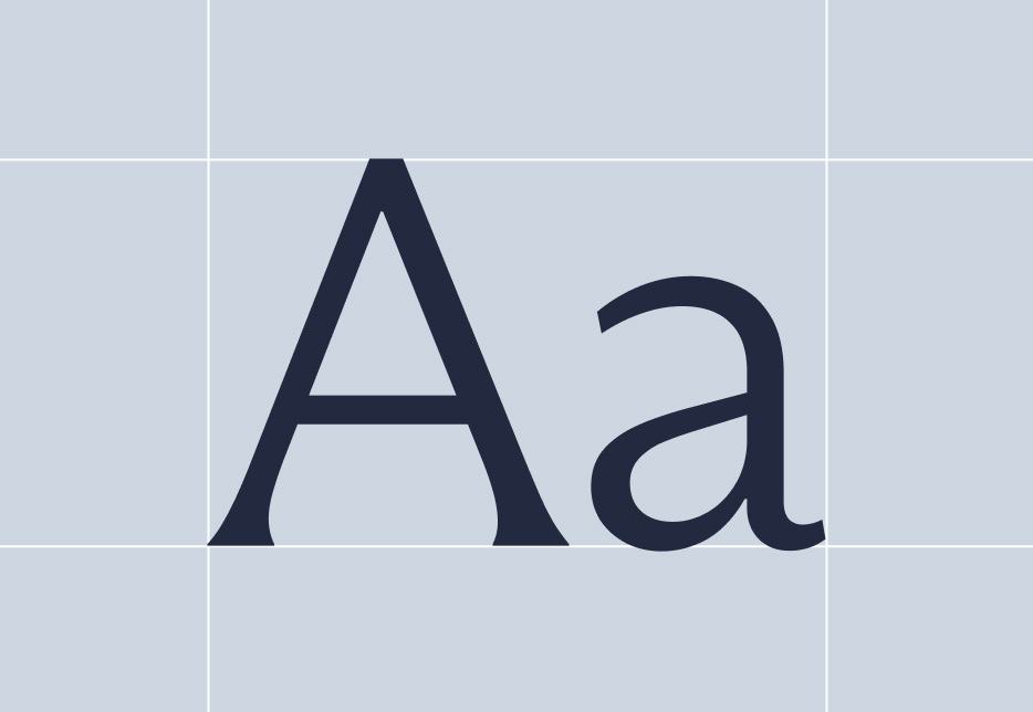
Forno Standard serves as Coastal’s secondary typeface, providing balance, versatility, and ease of use across all brand touchpoints.
Its clean structure and understated character support readability while maintaining a refined aesthetic. Used mainly for supporting text, and functional applications, Forno Standard ensures consistency and clarity without competing with the expressive nature of the primary typeface.
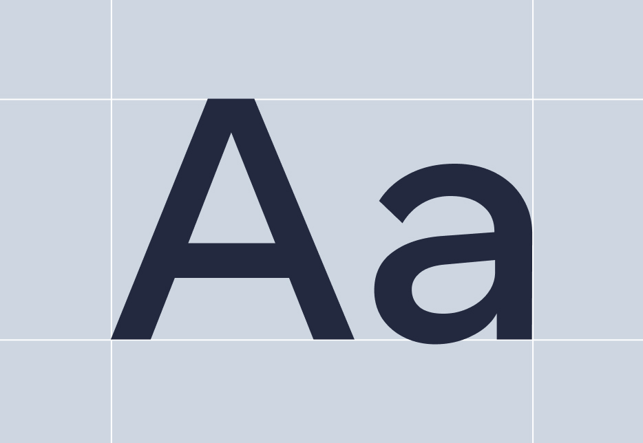
Primary Typeface
Arizona Flare
Secondary Typeface
Forno Standard
Sizing
Typography is scaled with intention—establishing a clear hierarchy that guides the eye with ease. Larger sizes create presence and clarity, while smaller text remains measured and highly legible. The result is a system that feels balanced, composed, and quietly confident.
Primary Typeface
We’re not just building homes for clients, we are shaping how they live. Grounded in trust and collaboration, we guide each project with clarity, personal style, and uncompromising craftsmanship. The result is a home that endures and a relationship that defines the future of design-led property.
Type Sizes 10–30pt/px
110% Leading
0% Tracking
Design-led homes and communities, masterfully built to embrace daily living through architecture, craftsmanship, and enduring quality.
Type Sizes 30–55pt/px
110% Leading
0% Tracking
Crafted for elevated living.
Type Sizes > 60pt/px
110% Leading
0% Tracking
Secondary Typeface
Our team works diligently to recover lost funds, correct inaccuracies, and keep your financial records accurate—so you can feel confident about every dollar in your account.
Type Sizes 24–55pt/px
120% Leading
20% Tracking
06 Imagery
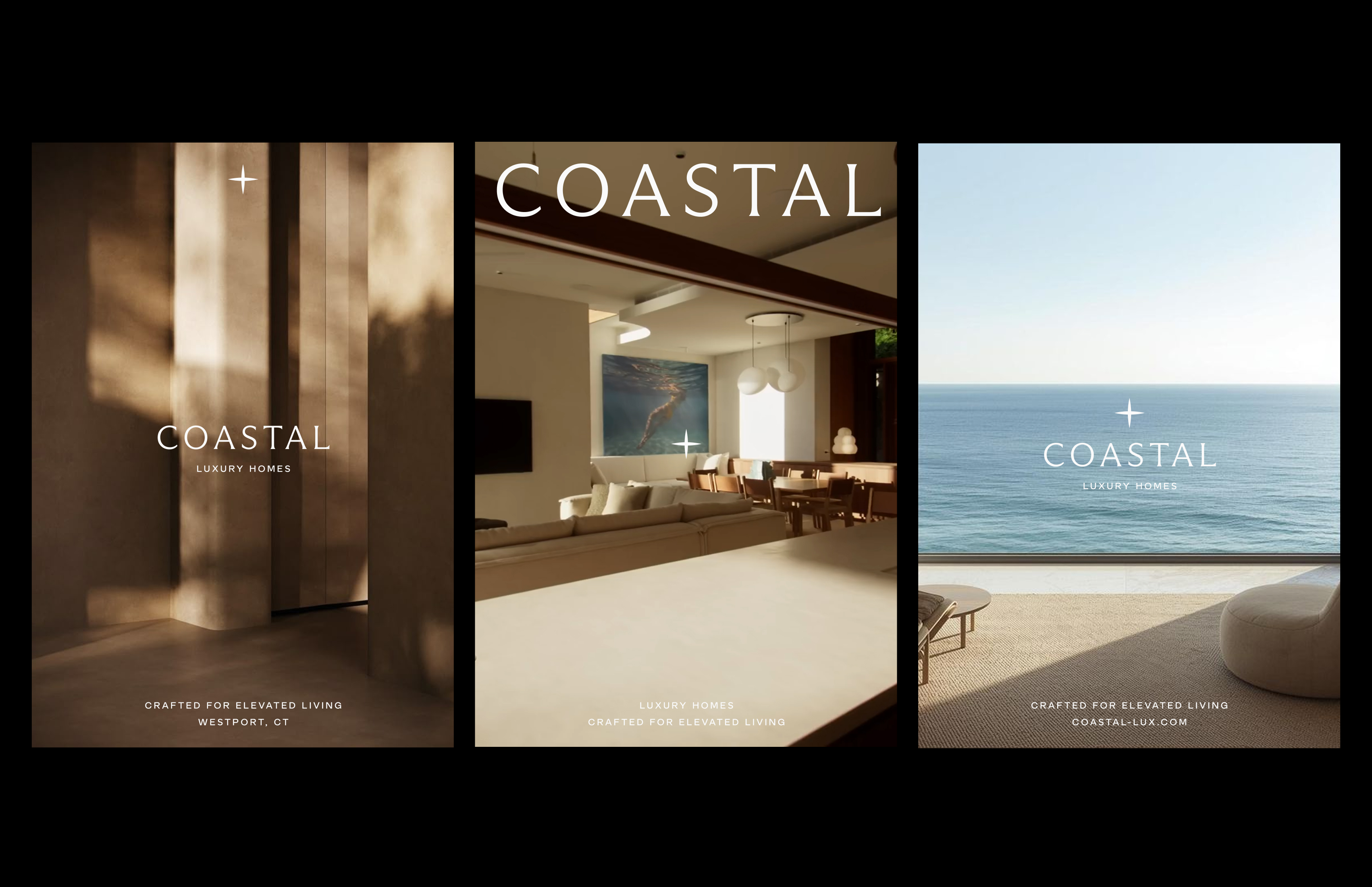
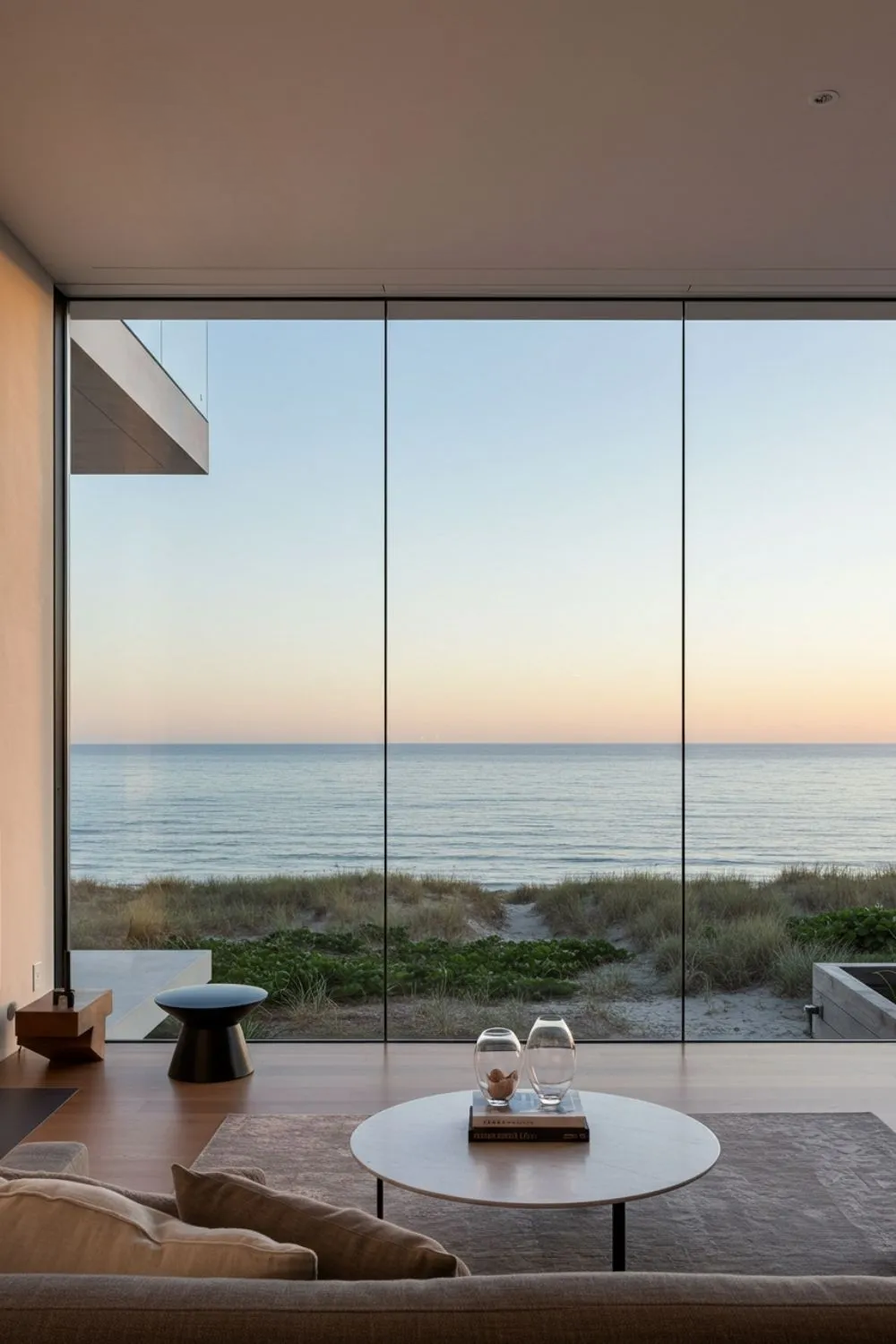
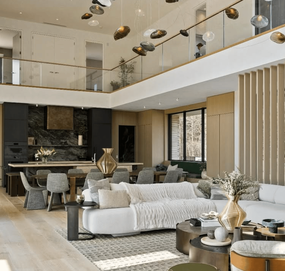
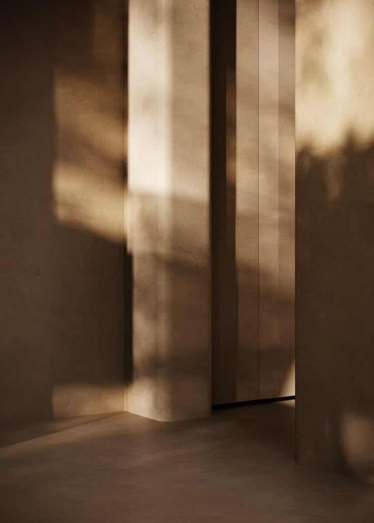
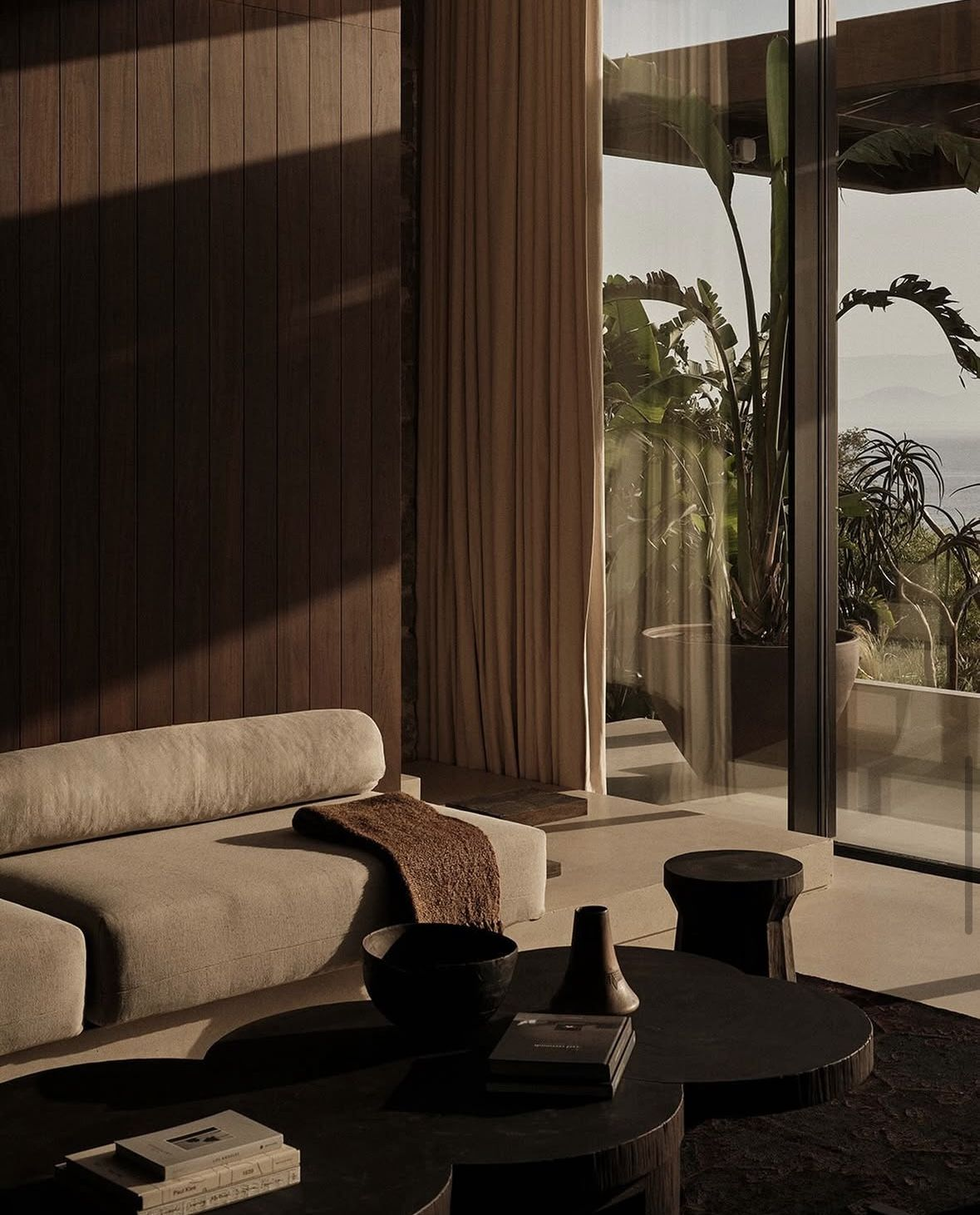
Coastal’s photo and video strategy balances clean architectural composition with moody, atmospheric details. Wide, structured shots capture clarity, proportion, and spatial intent, while closer frames highlight texture, materiality, and light.
The result is a visual language that feels both clean and professional, while also connecting with something emotional — grounded in architectural rigor, yet softened by a sense of warmth, depth, and place.
Video should find it’s way into all form of digital media, and should purposefully mix in with photography.
Photography | Architectural Compositions
Photography | Moody, Atmospheric Details
Video | Fixed camera, light motion, maybe occasional fast movement on social
07 Print Application
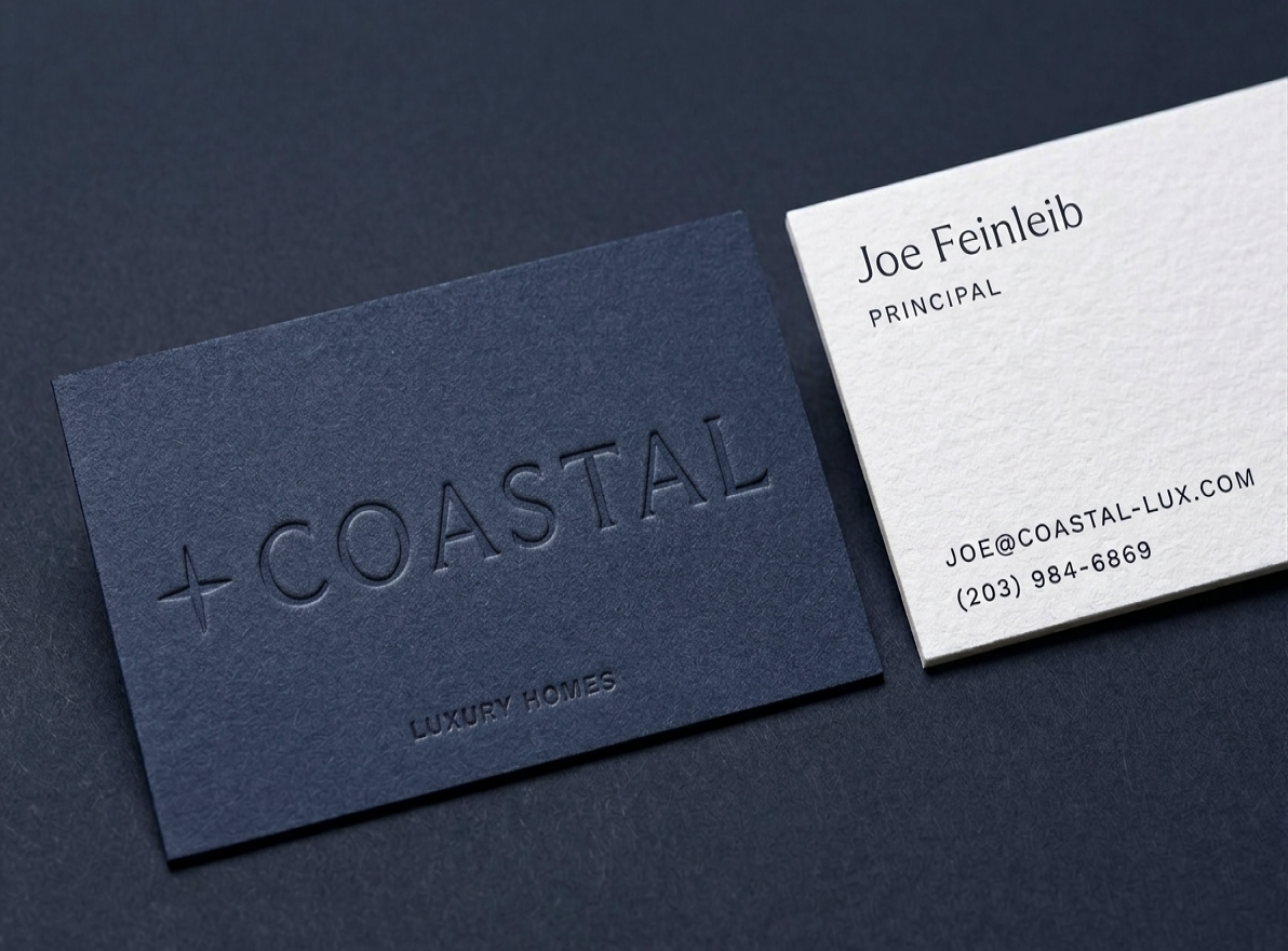
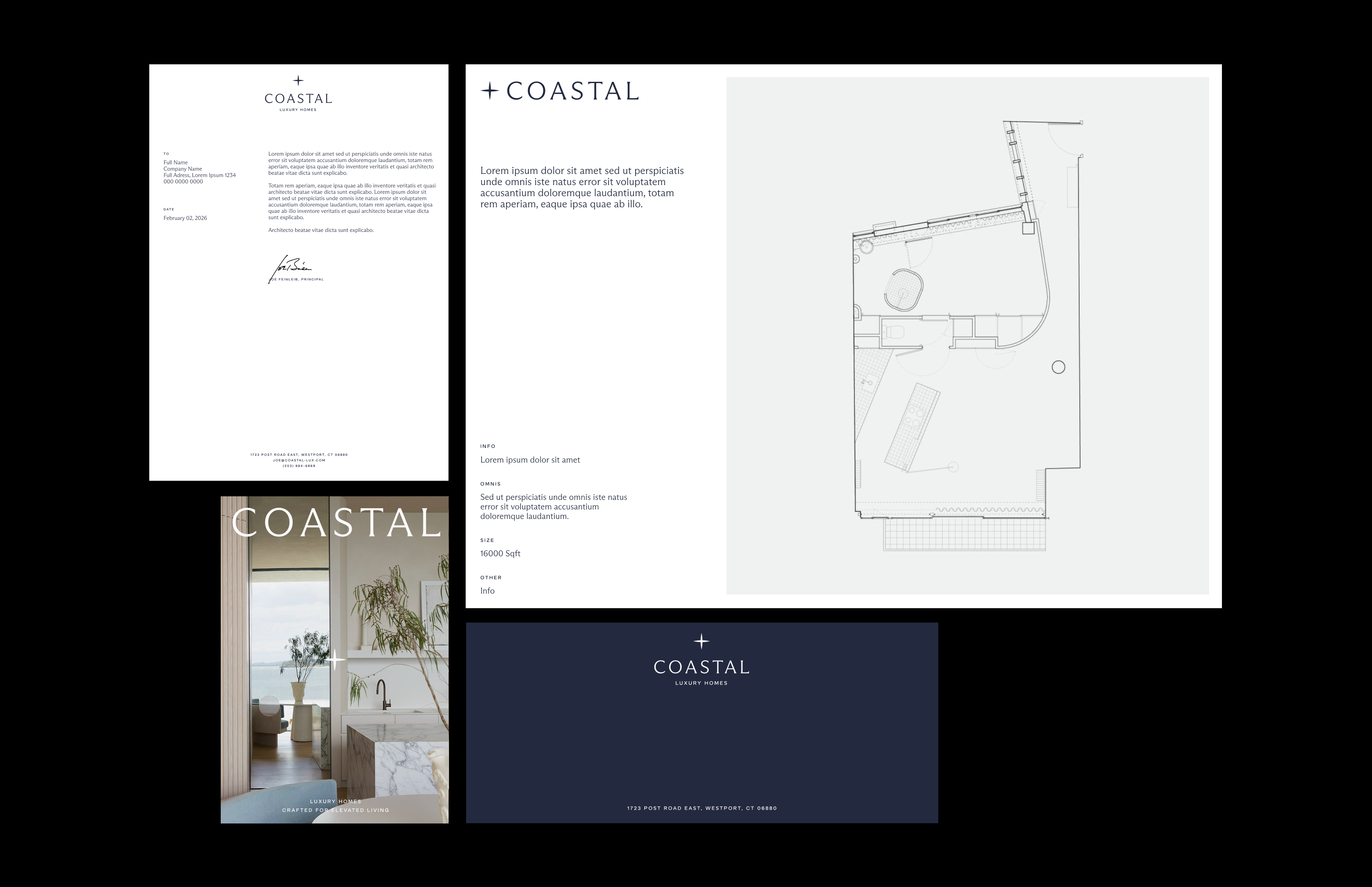
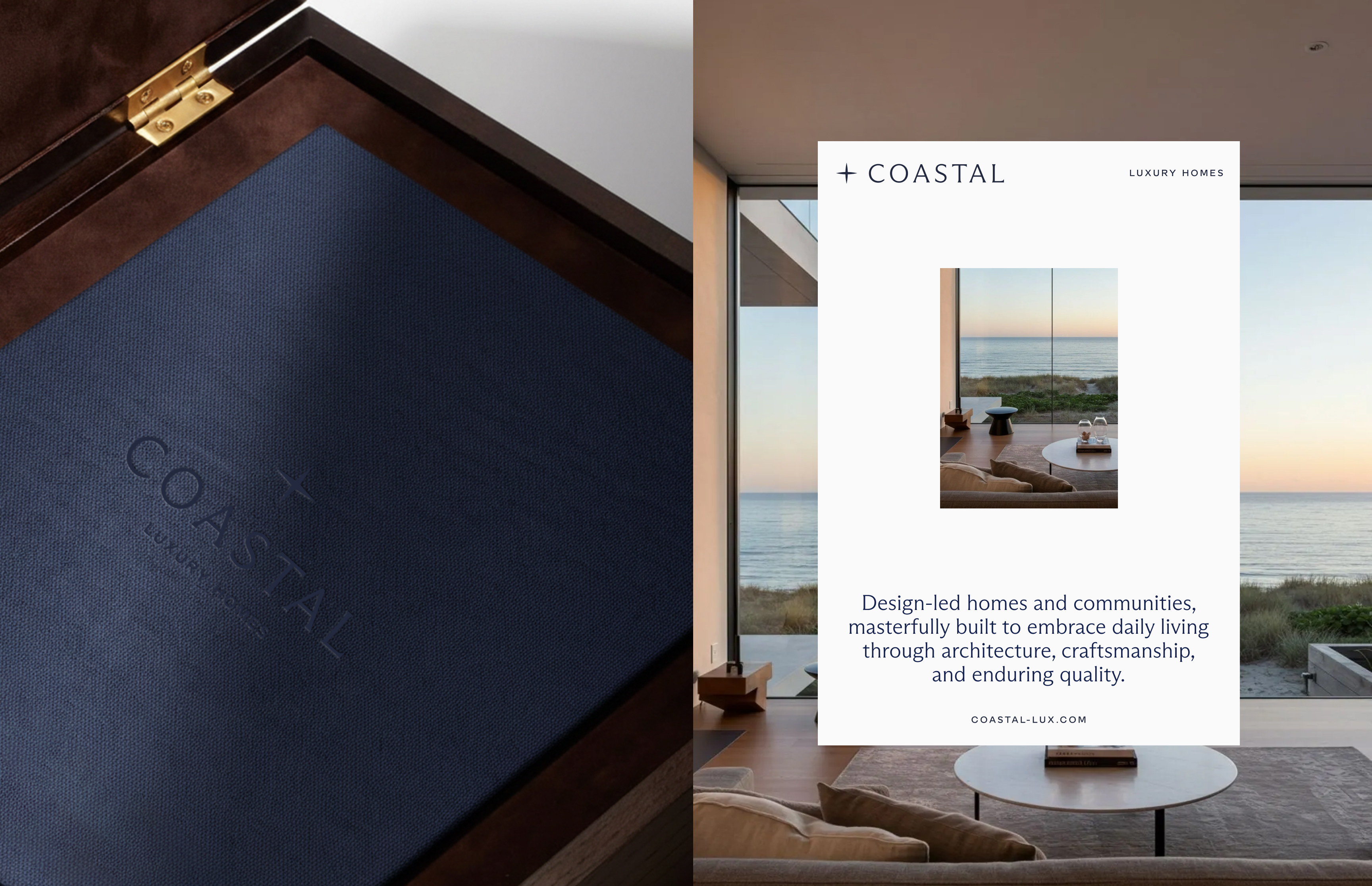
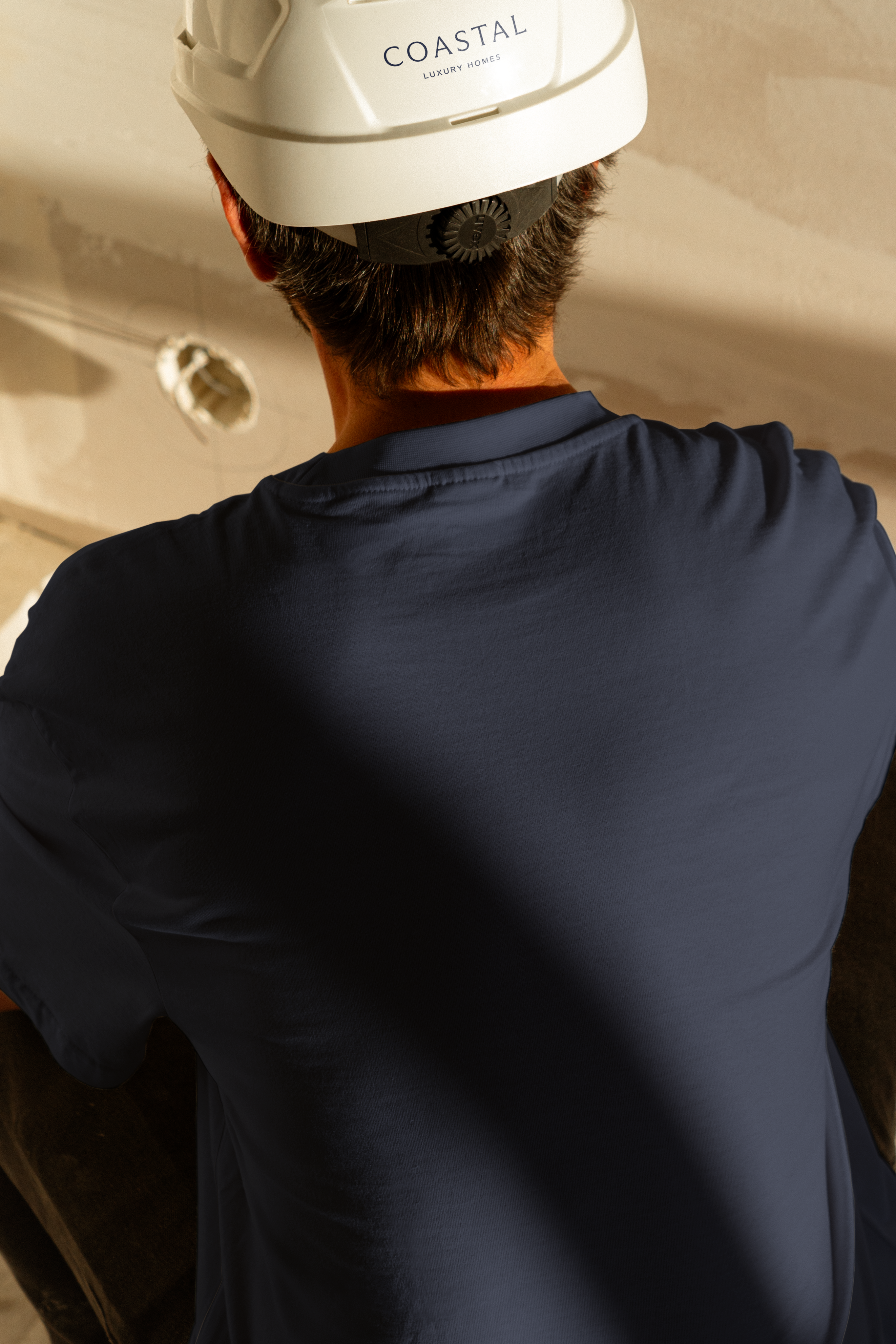
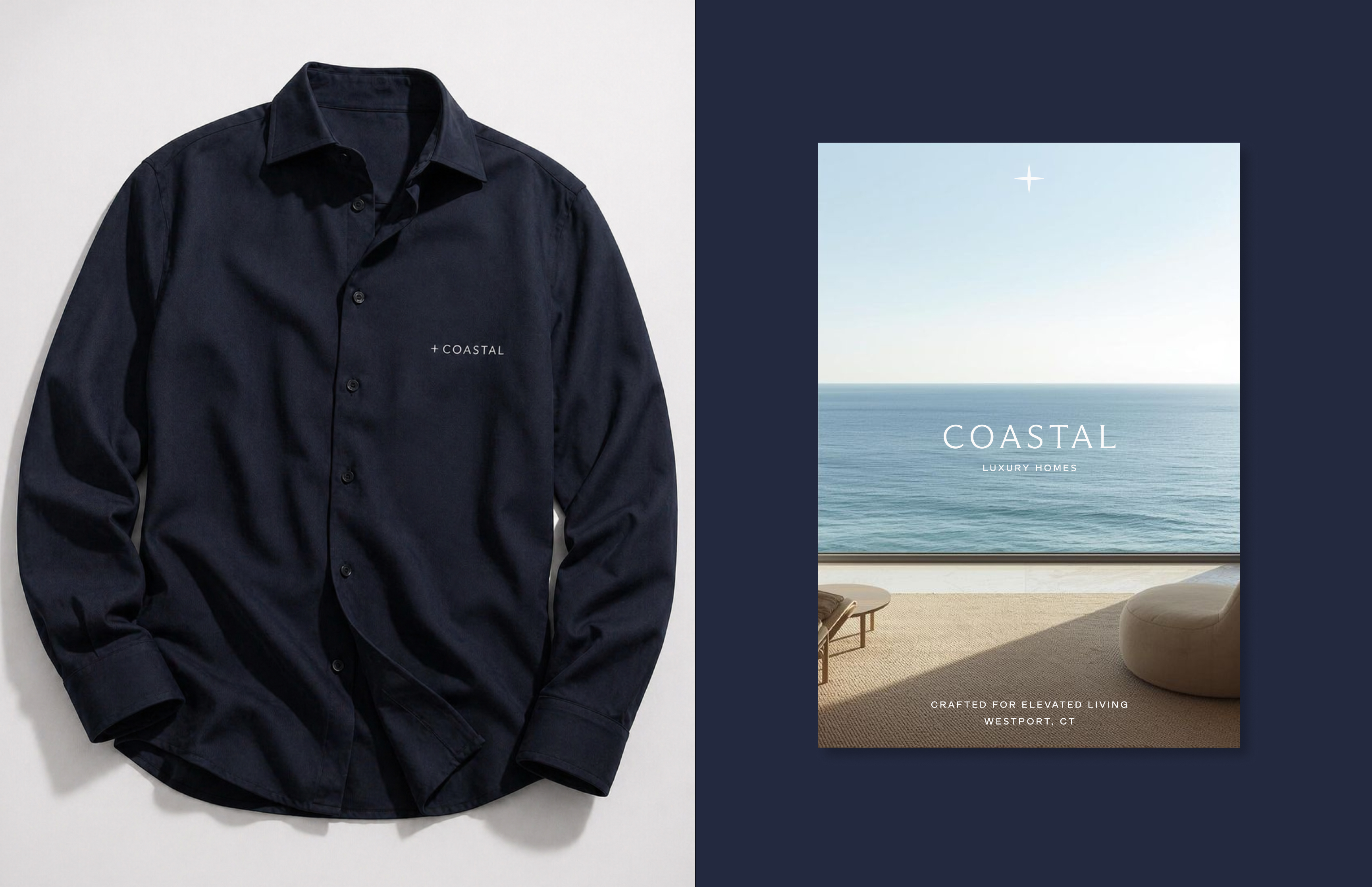
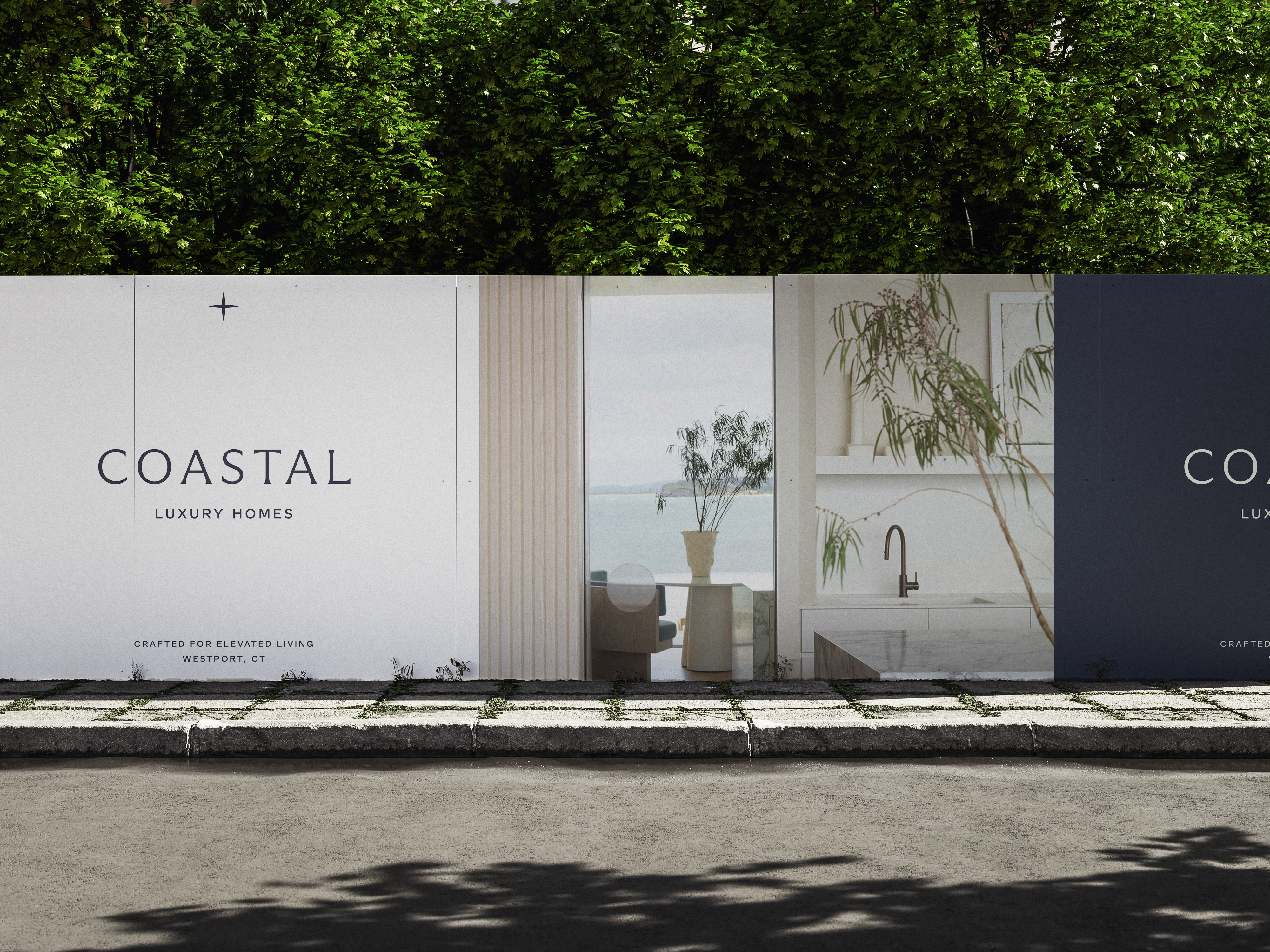
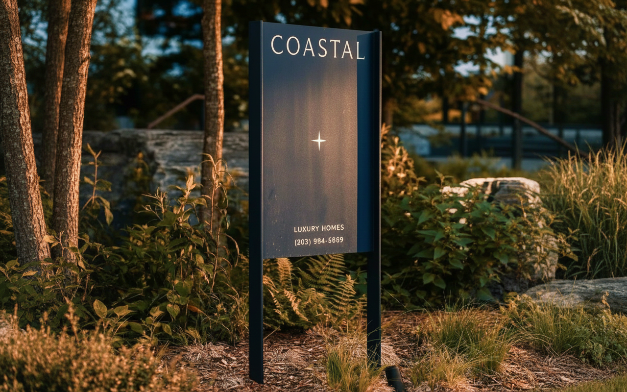
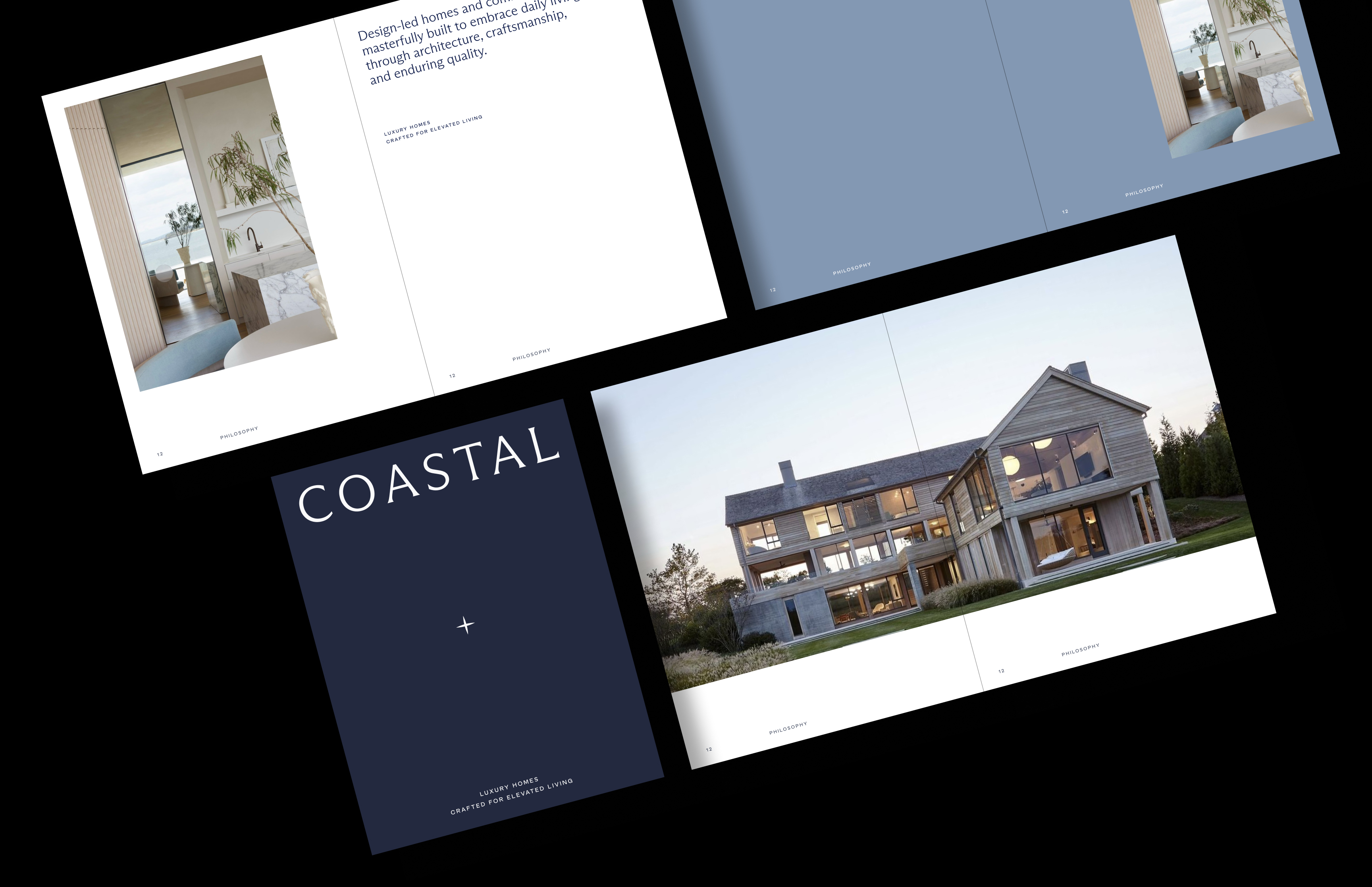
Coastal Luxury Homes print applications are designed to extend the brand’s sense of refinement into every physical touchpoint, from business cards and stationary to a complete client experience onboarding suite and signage system.
Each piece should feel elevated, and consistent —reflecting the same attention to detail and timeless quality that defines the brand.
08 Digital Application
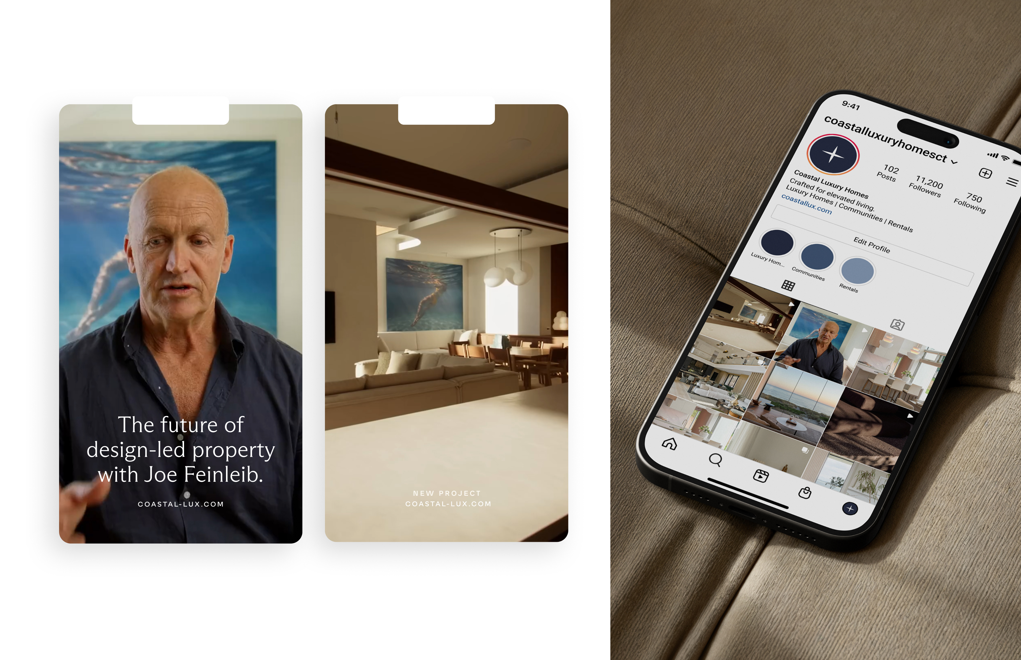
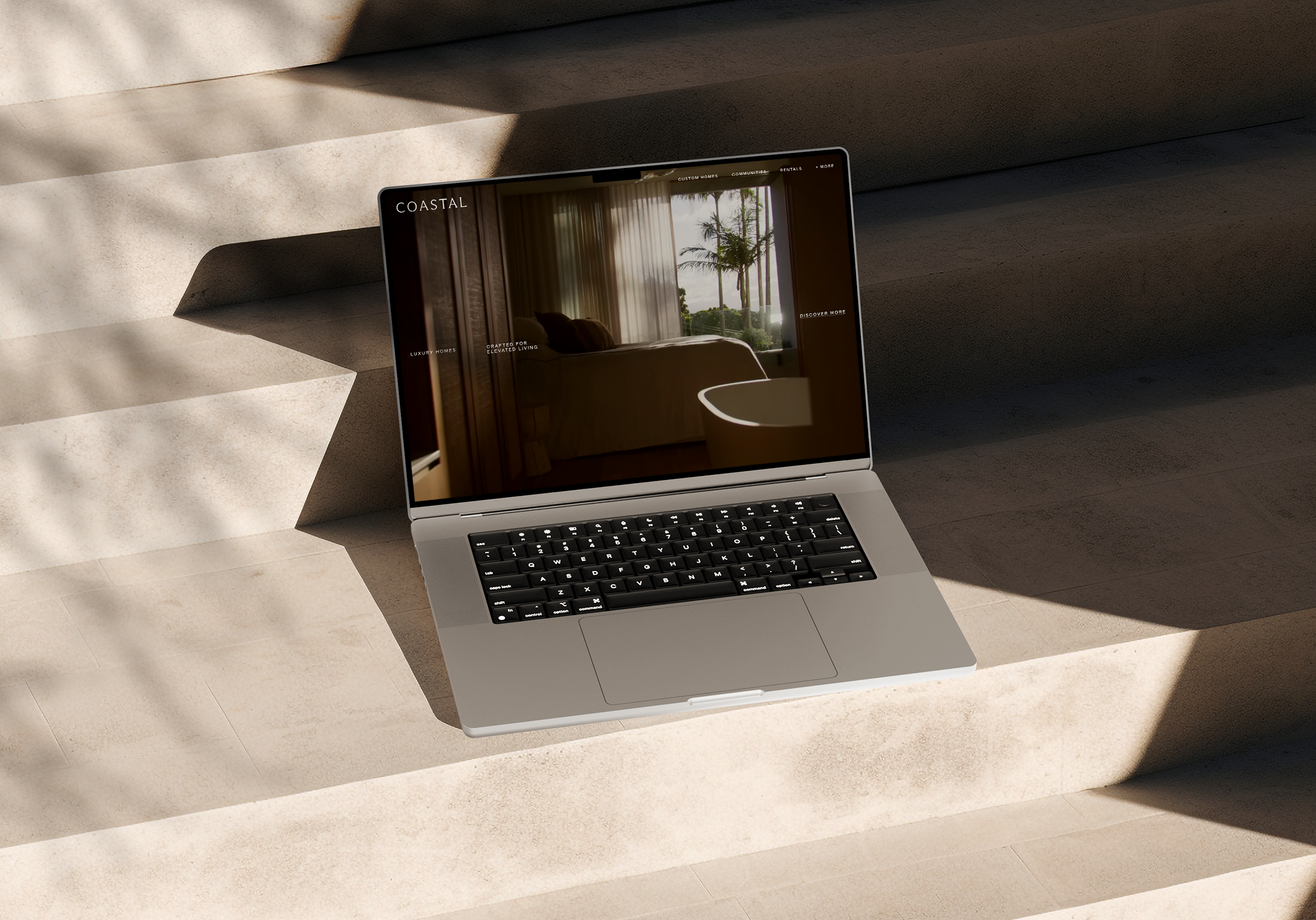
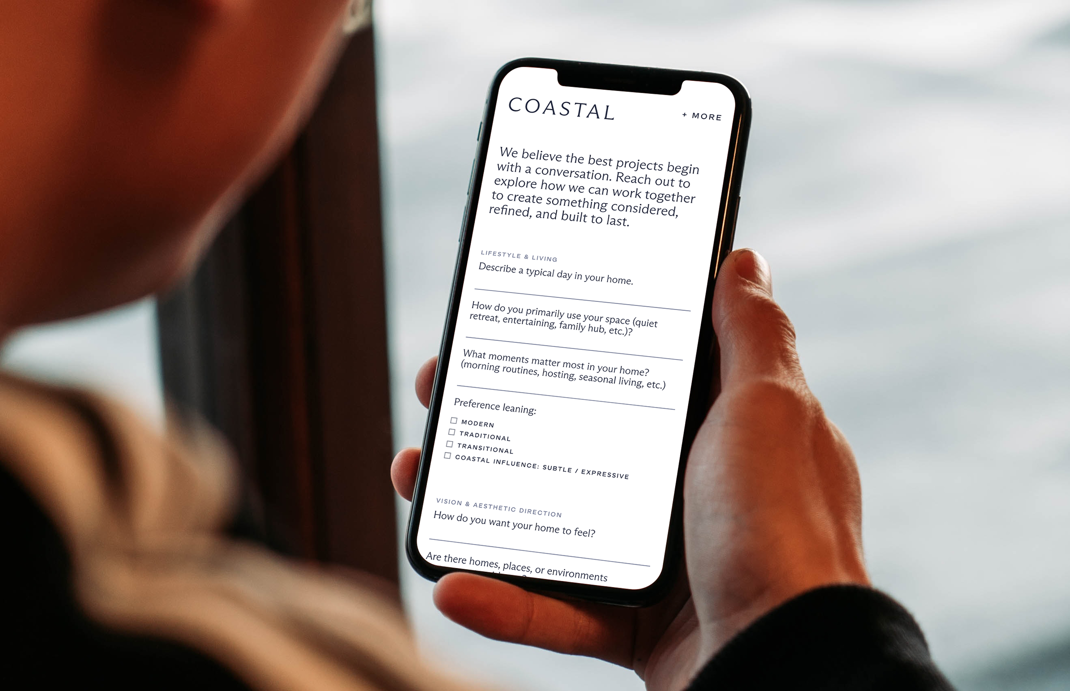
Across the website, social platforms, and digital communications, every touchpoint should feel seamless and refined — creating a cohesive experience that is both visually elevated and easy to navigate.